NBC News Now ‘tinkers’ with its font
NBC News Now, NBC’s free news streaming service, has switched its logo to the proprietary font that’s slowly spreading to all realms of the peacock network.
NBC News Now, NBC’s free news streaming service, has switched its logo to the proprietary font that’s slowly spreading to all realms of the peacock network.
It’s time to put creativity back into design again

The result is a list of 200 groundbreaking inventions (and 50 special mention inventions)—including the world’s most powerful supercomputer, a game-changing entertainment venue, and a new shape—that are changing how we live, work, play, and think about what’s possible.

Are you looking for the perfect gradient or a seamless transition between two colors? Our new tool, Colors in Between, is here to revolutionize the way you work with color gradients. Whether you’re a graphic designer, a digital artist, or just someone who loves to experiment with colors, this tool is designed to spark your creativity and simplify your color decisions.
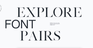
Monotype, the world-famous type foundry, is making the decision process less stressful for designers with a Font Pairing Generator. Powered by artificial intelligence, the tool is designed to assist creatives in their search for the perfect font duo.

These examples show how parallax scrolling websites should be done.
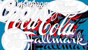
When Johnson & Johnson’s recent abandonment of its 136-year-old cursive logo was followed quickly by Eddie Bauer ditching its script wordmark of six decades, alarm bells rang in all corners of the design and branding spaces.

Designers need to participate in the development of AI or face having the future world designed without them, warns Airbnb co-founder Brian Chesky in this exclusive interview.

Effective collaboration between designers and developers is vital to creating good user experiences. However, bridging the handoff between design and development with the many tools and workflows available today has its pitfalls. Matthew Mattei introduces you to the Uno Platform. This free and open-source project offers a robust set of productivity boosters, including a design-to-code plugin that fosters better designer/developer collaboration.