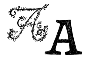
Design stories

The worst Macs of all time: from the Apple III to the 12-inch MacBook

Apple likes to portray its Macs as the best, most innovative computers in the world, so it can be easy to forget that the company has released some real stinkers over the years. Not every Apple computer has been a hit — some have been downright awful.

This 1970s Nike manifesto is absolutely wild

Is a modern office really an office without inspirational quotes scrawled across the walls, on the stairway and in meeting rooms? These days, such quotes are part and parcel of office life, though it’s hard to know whether anyone ever does actually feel inspired by said maxims. We bet the ones in your office don’t quite stick in the mind as much as those in an old internal memo from…

10 Things No One Told Me About Design Systems

This UX designer learned the hard way, but you don’t have to.

Scalable Typography for a Growing Ecosystem of Products.

As someone who has seen firsthand how a poorly maintained typography system can lead to disaster, we can attest to the importance of keeping it in order from the very beginning of a project. You never know how big a project will become in the future, so it’s crucial to consider scalability when designing elements.

Collective #748

A lush and joyful design with visuals that will leave you with a warm feeling in your belly! Our pick this week.

LogoCereal’s Daily Challenge

Test and improve your design skills with daily challenges sent straight to your inbox. Each challenge is randomised and written to help you increase your efficiency.

The State Department is ditching Times New Roman for Calibri

The State Department has used Times New Roman for its official communications since 2004. Now it’s switching to the sans-serif Calibri in an effort to improve accessibility.

How the senior designers I trained at Apple & Meta developed faster than others

Our VP of engineering recently asked me how we could level up the design skills of our engineers. It made me think about the question “how do great designers become great?”

Are these Google logo concepts better than the real thing?

Google released a bunch of new logos and icons for its various Workspace apps in 2020 – to a chorus of disapproval. Users continue to complain about these bafflingly similar designs – but a series of fan-made icon concepts seems to be gaining applause on Twitter.

10 Font Trends 2023: The Year of User-Oriented Typography

If you need a trouble-free method to understand what the design industry is up to, look at the typography trends. Fonts are like friends, they never lie.

1 2 138 139 140 141 142 163 164

Submit an article

You can submit new articles related to web design / development, UX, apps and graphic design. No homepage submissions, no spammy affiliate links will be accepted.
Title
URL

Thank you!

Thanks for submitting your story. We will review it and approve it if relevant.