
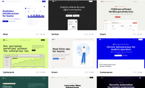
Design Skills for AI
Browse 90 design skills and use them to give Claude, Codex, Cursor, and other AI coding tools a consistent visual direction for generated UI.
Browse 90 design skills and use them to give Claude, Codex, Cursor, and other AI coding tools a consistent visual direction for generated UI.
Building for the web in 2026 means juggling two pressures at once: clients want AI baked in somewhere, and most of them want to sell something online.
There’s a moment every freelance designer knows well. You post a project you’re proud of, it gains traction, and suddenly there’s a new inquiry in your inbox. Then another. Maybe a referral from someone who saw your work on Dribbble months ago. The momentum is real—and it’s exciting.
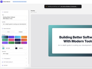
Generate stunning cover images
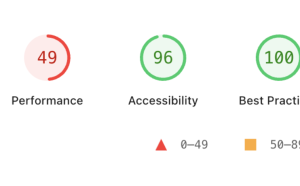
Lighthouse 13.3 came out this week, and includes a new category called “Agentic Browsing”. Let’s take a look at the new audits included in this category.
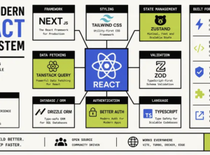
A comprehensive overview of the best React libraries and tools in 2026, including Next.js, TanStack Start, Zustand, React Hook Form, Tailwind CSS, and more.
With work moving more fluidly between code and canvas, workflows aren’t just changing—they’re converging.
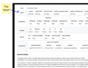
Google has announced that it is officially open-sourcing its DESIGN.md format – a standardized specification originally developed for its own design tool, Stitch.
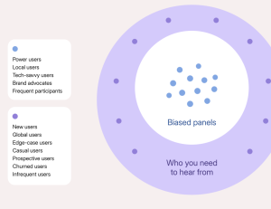
Internal research panels are often seen as a perfect solution to the participant-recruiting challenges. And in many cases, they are. Well-designed panels can accelerate studies, save money, and yield higher-quality participants. However, managing a panel requires ongoing effort beyond initial setup.


