Highlights from 36 Days of Type 2023, Halfway Through the Challenge
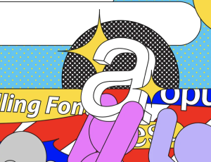
The design studio Treintayseis‘ annual online challenge calls on typographers, graphic designers, and creatives of all stripes to create a letter (or number) for 36 days straight.
The design studio Treintayseis‘ annual online challenge calls on typographers, graphic designers, and creatives of all stripes to create a letter (or number) for 36 days straight.
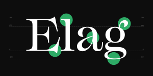
Typography is an essential element in any design, and choosing the right typeface makes all the difference. That’s where Mackay comes in — a powerful transitional serif designed for both screen and print.
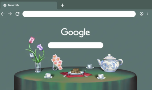
To celebrate Asian Pacific American Heritage Month, we commissioned AAPI artists to create a collection of themes for Chrome browser.
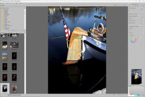
In this article, I will look at the impact of RawShooter on Lightroom, and how it helped shape the software we know today. It is not meant to be a review but a remembrance of RawShooter.
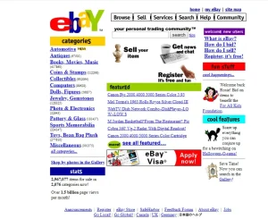
Web evolution: The trends of the ’90s static digital brochures

Nothing you see is 100% original, so take someone else’s ideas, improve it, and make it your own.
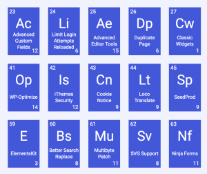
To celebrate the 20th anniversary of WordPress, this table showcases the 108 most popular WordPress plugins in a unique way.
A clean, consistent, and pixel-perfect icon set (20×20, 1.5px) crafted specifically for modern UI design.
Fonts that fail to adapt to new technologies can quickly become outdated and fall out of use. However, beyond this, are we also limiting type diversity by only reviving certain fonts? Here are my thoughts on modern-day font revivals.
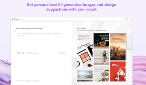
With Microsoft Designer, simply type in your ideas to get one-of-a-kind AI-powered designs & suggestions to meet your social media & digital needs. Create social posts, invitations, and more. Available as a web app, mobile versions are coming soon.