Monotype inks deal with The Font Bureau to acquire collection
Thirty-nine typefaces from The Font Bureau, including David Berlow classics Belizio, and Bureau-Grot, join the Monotype Library

Thirty-nine typefaces from The Font Bureau, including David Berlow classics Belizio, and Bureau-Grot, join the Monotype Library
“It should be clear and concise, with a kind of beauty and precision which flow not from the quill, but from the compass and ruling pen.”
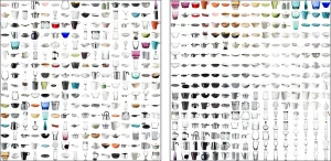
Maximizing Image Viewing Efficiency: How Visual Sorting Can Help

Kia violated these 4 basic design principles.
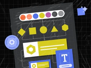
Design tokens are the building blocks of design systems. Design tokens adoption ensure unified, flexible and scale-ready design systems.
A short film series exploring how Google is imagining an adaptive, personal, and expressive future for design
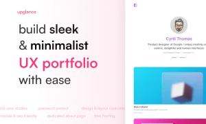
A simple platform that helps you to build hassle-free minimalistic professional UX portfolios for free. Write case studies on a medium-like editor, Password-protection, Design & Layout customizations, Mobile and SEO friendly, and more.
Nintendo’s logo has graced blockbuster consoles and tragic, expensive failures alike (hello, Virtual Boy!). In the process, it has become the visual stalwart that unifies Nintendo’s many experiments.
All three of the website design trends here mimic something bigger going on in the tech space, from a desire to have more real connections (handwriting) to nods to social media (stickers) to models that are rooted in artificial intelligence. Every one of these design themes is more than a technique; it carries a tie to the greater world around us.

The importance of iconography in communication and highlights how design adapts to changing user needs and preferences while keeping up with technological advancements.