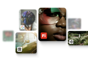
Latest stories

Content for fun vs. content for purpose: designing for two distinct modes of consumption

From AI assistants to digital platforms, how can we design for rapid mode switching in real life? Reflections about utilitarian and experiential content and why understanding both matters.

Creating proportional, equal-height image rows with CSS

Equal-height image layouts seem simple until you try to build one that’s truly responsive. This tutorial walks through my solution using flexbox aspect ratios, the Eleventy Image plugin, and a Nunjucks shortcode.

How to Build a Successful Product

I joined the company as the first full-time employee and, over five years, tried on multiple roles — from product design to strategic planning. I helped the product evolve from an idea to a market-ready service, went through one pivot, and gathered a lot of insights along the way. Here’s what I learned — I hope these lessons help you avoid common mistakes in your own journey.

Better Notifications, Smarter Image Rows & UI Layer Tricks

This week, I found myself surprisingly invested in the great modal drawer debate. A perfect reminder that even the smallest UX choices spark strong feelings. In this issue, you’ll find smart takes on notifications, a neat CSS image grid trick, and a peek at design careers without the usual fluff.

Tiny Screens, Big Impact

Learn why flip phones still matter in 2025, and how you can build and launch web apps for these tiny devices.

27 College Fonts for Creating Academic-Inspired Designs (2025)

Ever wondered where that bold, slab-serif “college look” comes from? It goes way back to mid‑19th century Ivy League sportswear. Harvard’s baseball team embroidered an “H” on their flannel jackets in 1865, making them the first varsity-style letter sweaters.

5 Powerful MCP Servers To Transform Your Development Workflow

The Model Context Protocol (MCP) is an open standard that lets AI assistants connect with external data sources, tools, or systems. This makes them much more useful by allowing them to do things like run code, manage files, and interact with APIs.

The making of a product icon

Creating product icons at Figma involves dozens—sometimes hundreds—of iterations. Product Designer Tim Van Damme shares his thoughtful approach to icon design and the creative exploration that shapes each final result.

Designing for Touch: How Finger-Friendly UI Enhances UX

With mobile devices dominating the way we interact with apps and websites, touch-based design has become more important than ever.

Reform Collective: A New Website, Designed to Be Seen

Reform Collective’s new site strips away the noise in favor of clarity, performance, and structure—with the tech lead detailing how AI, GSAP, and CSS hacks brought it to life.

1 2 3 4 5 6 7 494 495

Submit an article

You can submit new articles related to web design / development, UX, apps and graphic design. No homepage submissions, no spammy affiliate links will be accepted.
Title
URL

Thank you!

Thanks for submitting your story. We will review it and approve it if relevant.