
Introducing Claude Design
Today, we’re launching Claude Design, a new Anthropic Labs product that lets you collaborate with Claude to create polished visual work like designs, prototypes, slides, one-pagers, and more.
Today, we’re launching Claude Design, a new Anthropic Labs product that lets you collaborate with Claude to create polished visual work like designs, prototypes, slides, one-pagers, and more.
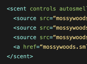
A lot has happened in CSS in the last few years, but there’s nothing we needed less than the upcoming Olfactive API. Now, I know what you’re going to say, expanding the web in a more immersive way is a good thing, and in general I’d agree, but there’s no generalized hardware support for this yet and, in my opinion, it’s too much, too early.

Today’s colleges and universities are being asked to do far more than just award degrees. Rising tuition costs, shrinking enrollment and retention, and a rapidly changing job market are forcing institutions to rethink what academic success looks like today.
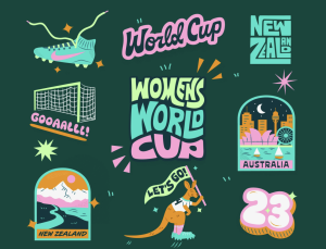
From rising media valuations to record-breaking attendance and brand investment, the shift is undeniable. Publications like Print Magazine are calling it a “golden age” of women’s sports branding. Forbes is outlining how brands can meaningfully participate in the revolution. And leagues like the WNBA are doubling down on expansion, storytelling, and identity-driven growth.
After Anthropic released Claude Code’s 2.1.88 update, users quickly discovered that it contained a package with a source map file containing its TypeScript codebase, with one person on X calling attention to the leak and posting a file containing the code. The leaked data reportedly contains more than 512,000 lines of code and provides a look into the inner workings of the AI-powered coding tool, as reported earlier by Ars Technica and VentureBeat.
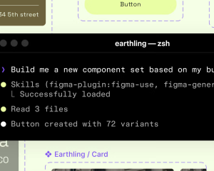
Starting today, you can use AI agents to design directly on the Figma canvas. And with skills, you can guide agents with context about your team’s decisions and intent.
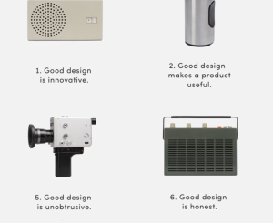
We often see design principles as rigid guidelines that dictate design decisions. But actually, they are an incredible tool to rally the team around a shared purpose and document the values and beliefs that an organization embodies.
Website development is shifting from traditional engineering-heavy workflows to a new model where non-technical users can build full applications using AI-driven tools and simple command-based inputs. This approach is often referred to as vibe coding — focusing on intent and outcome rather than syntax and implementation.
Most product teams don’t have a user research problem, they have an activation problem. Interviews are conducted, insights are documented, findings are shared in a slide deck and then the project moves forward without any of that work meaningfully changing the direction. The research sits in a folder, and the product gets built on instinct.
CLI coding tool that generates design system specification and style guides for agentic programs like OpenCode, Claude Code, Codex, Cursor, and more.


