Web Design stories

Creative Exploration

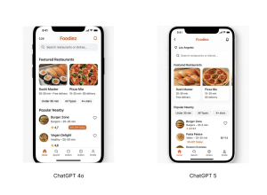
Telling designers they shouldn’t use high-fidelity designs early in the exploration process can be the equivalent of telling an artist they shouldn’t use paint and instead only start with rough pencil sketches.

Mastering Shadows: Fix Common Mistakes

For all digital designers who design interfaces: are you happy with those gray shadows you’ve been slapping on your designs?

Using an analogous color scheme in UX design

The world is naturally painted with color, from the greens of the trees to the blues of the ocean. Think of the emotions you feel when looking at a rainbow or a sunset during the golden hour. The harmony of colors in nature often inspires many of the color schemes we use in the digital world.

Making My Blog Interactive

What’s the smallest thing that can help you realise that other people are here too?

Storefront hero section examples with Tailwind CSS

Use these hero sections built for e-commerce websites as the storefront part of your homepage where you can add CTA sections and show promotions to increase conversion rates

Swiss Web Design — a case study

Swiss web design is more than just an aesthetic choice; it’s a purposeful approach to delivering clean, intuitive, and effective digital experiences.

The Big Difference Between Digital Product And Web Design

Designing for digital products requires a different mindset than traditional websites. It’s all about continuous adaptation, refining, and iterating as user behavior and needs evolve. Paul Boag reflects on the key differences, including how the frequency of usage impacts your design approach and what you can do about it.

Why CSS View Transitions Are Revolutionizing Web Design

View Transitions are one of the most awesome features CSS has shipped in recent times. Its title is self-explanatory: transitions between views are possible with just CSS, even across pages of the same origin! What’s more interesting is its subtext, since there is no need to create complex SPA with routing just to get those eye-catching transitions between pages.

CSS finally adds vertical centering in 2024

align-content works in the default layout in 2024, allowing vertical centering with 1 CSS property.

State of CSS 2024

It’s amazing to witness the speed at which CSS keeps evolving. While the past decade has been all about building a solid foundation for layout (Flexbox, Grid) and syntax (variables) the future promises to be about going much further than most of us ever dreamed of.

1 2 3 4 5 6 47 48

Submit an article

You can submit new articles related to web design / development, UX, apps and graphic design. No homepage submissions, no spammy affiliate links will be accepted.
Title
URL

Thank you!

Thanks for submitting your story. We will review it and approve it if relevant.