How to Stand Out in a UX Interview
What do recruiters look for in a UX candidate? We surveyed a few. Use their insights to dig deeper in your resume, portfolio, and storytelling.

What do recruiters look for in a UX candidate? We surveyed a few. Use their insights to dig deeper in your resume, portfolio, and storytelling.

Where basic search displays a list of results, advanced search enables users to refine their search queries for highly targeted results using filters, facet selection, and other parameters. This filtering lets users find specific information faster than sifting through queries–especially when there is vast content.

We love the simplicity and elegance of this design. It’s enhanced with smooth animations and an interesting menu hover effect. Our pick this week.

Are you looking for ways to improve your business website? Want to learn the key website design facts and figures that should guide your online strategy?

To be sure, I asked ChatGPT itself and it didn’t disappoint me…

Are you tired of grappling with clunky payment processes, frustrated customers, and missed growth opportunities? It’s time to revolutionize the way you handle transactions and take your business to new heights.
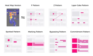
Understanding the psychology of attention helps to make sense of how humans are perceiving and navigating through digital interfaces.
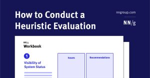
Step-by-step instructions to systematically review your product to find potential usability and experience problems. Download a free heuristic evaluation template.

A cautionary tale of Figma and the series of events that led to its latest release at the Config23 Conference. Read to the end to see the other side.
While the summer season seems to be the time when trends slow down some, there are still new things happening in website design. Often this is a season of design evolution, rather than complete overhauls of standard design practices.