Gestalt Principles of Design — Similarity
When objects look similar to one another, the mind perceives them as a group or pattern.
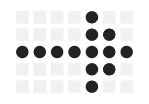
When objects look similar to one another, the mind perceives them as a group or pattern.

Accessible web design is not just a ‘nice to have’ it is required by law in countries such as the US, Israel, Canada, the United Kingdom among others. In fact, 2,000 website accessibility lawsuits were filed in the United States in 2019 alone.
We love the website of Euphemia for its clean and slick design. It has a wonderful motif and some playful interactions. Our pick for the inspirational website of the week.
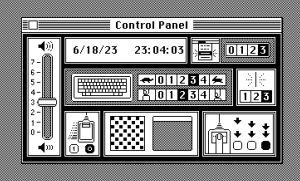
Mac OS control panel, 1984. No labels or explanations, just controls.
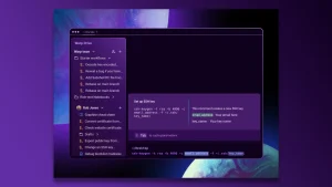
Command-line interfaces have barely changed in decades, but remain beloved by techies. Warp aims to modernize the whole experience—and add a dash of AI.

The new changes are designed to align Spotify’s desktop experience with its mobile app. You can now explore, browse and organize your libraries like you do on the company’s mobile app.
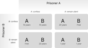
Boosting e-commerce conversion with countdowns and the prisoner’s dilemma.

The guidelines, ‘Principles of Spatial Design,’ ‘Design for spatial interfaces,’ and ‘Design for Spatial Input,’ offer invaluable insights into how to approach AR design.
Let’s explore design trends in UI/UX design, the history of art, and typography in our in-depth post covering millennia of human creativity by our Lead Designer, Hrvoje.