
Throwing curveballs: Shopify’s secret for staying ahead of the game
By shaking up business as usual, managers encourage their teams to think bigger.
By shaking up business as usual, managers encourage their teams to think bigger.
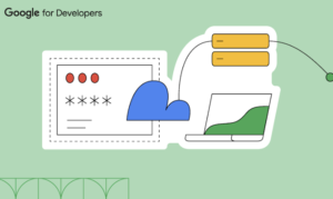
Passwords have been the standard sign-in method since the advent of personalized online experiences. How do we introduce the passwordless experience of passkeys?

The complexities of data visualization literacy

UI/UX designing has encountered changes, recommendations, and many upgrades. Such is the difference that the UI/UX of 2023 will be unrecognisable when compared to that of 2022. It moves swiftly, incorporating what’s best and leaving out what was once considered the best.

How constraints ignite creativity, spark innovation, and why accessibility is a uniquely effective constraint everyone should embrace.

Quirky, vibrant, and full of delightful surprises, Lief Amsterdam is our website of the week! With its stunning color palette, unconventional layouts, and smooth effects, it offers a truly unique browsing experience.
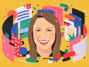
Dorelle Rabinowitz discusses micro expressions, taking credit for your work, and the challenges of working on a complex product like Adobe Acrobat
The term Bento Box originates in Japan, where it refers to a meal divided into its constituent parts and packed into a box. But in the design world, Bento Box is a design trend that is having a huge impact on how we design user interfaces.
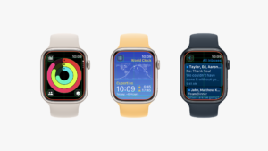
In its tenth iteration the user experience design gets a major update
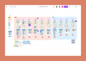
Assumptions mapping is important because it creates awareness of team members’ assumptions and potential associated risks. By making assumptions explicit and visible, teams can critically evaluate their validity and test them through research and validation methods.


