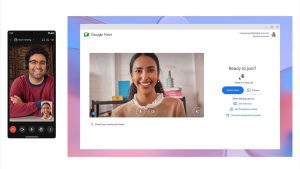
Google Meet’s New Device Switching Feature
Users can now seamlessly switch between devices during calls, eliminating disconnects and rejoins. This fosters a more adaptable work experience for the modern hybrid environment.
Users can now seamlessly switch between devices during calls, eliminating disconnects and rejoins. This fosters a more adaptable work experience for the modern hybrid environment.
It’s not uncommon for agencies to ask freelancers not to mention their employment status or even ask that you imply that you’re full-time when you interact with their client. Especially if the agency has a great reputation in regards to the quality of the service you are providing.

As a designer, presenting your work in the most creative and appealing way is crucial to winning over clients. This is where you can utilize AI-powered mockup generators, as they provide a fast, efficient solution to creating attractive mockups.

A well-crafted design system is a powerful tool for teams looking to create cohesive, scalable, and efficient designs. By establishing a shared language and a library of reusable components, a design system ensures consistency across your products, speeds up your workflow, and frees up your team to focus on solving user problems.
We’ve all heard the term thrown around, but what exactly does UX stand for? It’s user experience. Forget the misconception that UX design is all about making users feel happy and giddy. The truth is, UX design’s ultimate goal is to bring in the big bucks for the company. But there’s a catch: if the user experience stinks, users will abandon ship faster than you can say “failed product launch.”…
Design systems are a key tool for fostering collaboration between design and development teams. Features like auto layout, variables, and Dev Mode have facilitated closer integration between design and code. However, achieving widespread design system adoption remains a challenge.

Enough about me though, let’s dive into the mystery that’s been looming in the design sphere like Batman over Gotham: the phenomenon of dark mode UI.

The massive shift from developer-extended to developer-led platforms
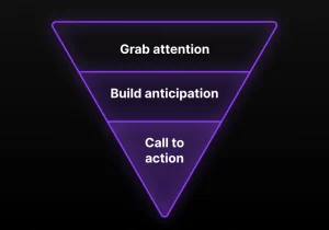
Boost landing page conversions with the inverted pyramid model

UX practitioners are being gaslit by people inside and outside of UX. It’s time to recognize it, stop believing and internalizing it, stand up to it, and say something. Stop pressing like on it and sharing it to others.