
Thoughts After 15 Years Spent In UX Design
In this two-part series, Andrii Zhdan outlines common challenges faced at the start of a design career and offers advice to smooth your journey based on insights from his experience hiring designers.
In this two-part series, Andrii Zhdan outlines common challenges faced at the start of a design career and offers advice to smooth your journey based on insights from his experience hiring designers.
sability testing is a critical aspect of user experience (UX) design that involves evaluating a product by testing it on real users.
Usability testing is a critical aspect of user experience (UX) design that involves evaluating a product by testing it on real users. The goal is to uncover usability issues, gather qualitative and quantitative data, and improve the overall user experience. There are two main types of usability testing: moderated and unmoderated.
In this two-part series, Andrii Zhdan outlines common challenges faced at the start of a design career and offers advice to smooth your journey based on insights from his experience hiring designers. Learn why mastering design tools is crucial, how to build a strong portfolio, and tips for acing your first interviews.
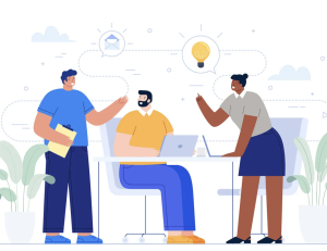
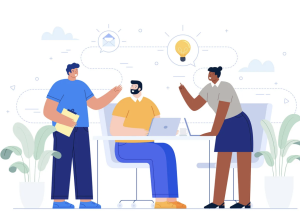
Many UX professionals often find themselves working alone, and usually face more projects impacting user experience than they can handle. In this article, Paul Boag explains how UX teams can be transformed into a significant driver of customer-centric innovation within organizations.

First impressions online are made in just a few seconds, so nailing your web design is crucial. Among the many elements to play with, one stands out for its universal appeal and psychological impact: human faces.
In my experience of building and supporting UX teams, most of them are significantly under-resourced. In fact, the term “team” can often be a stretch, with many user experience professionals finding themselves alone in their roles.

Becoming a team leader in UX design is not only a big responsibility but also a great opportunity to develop your leadership skills and contribute to the success of your team and company.
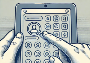
As UX professionals, we constantly face the challenge of making our designs intuitive and easy to use. A key aspect of this is discoverability — the extent to which users can find and understand the features and functionality of an interface.
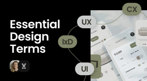
Anyone involved with a design department often encounters complex, unfamiliar abbreviations or terms. It’s common to end up Googling and reading articles to understand exactly how UX differs from UI and CX, what a product ecosystem is, and what service design entails. In this article, I’ll break down all these terms, explaining their origins, meanings, and usage areas. When you grasp the terminology, the processes become clearer, and your experience…


