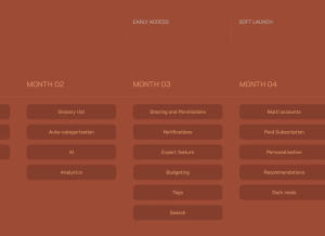
How Card-Based Layouts Shape Modern UX
These modular blocks of content make it simple to display images, text, buttons, and links in a way that feels intuitive and responsive across all screen sizes.
Rodolpho Henrique guides you through the essential aspects of color in digital design and user experience, from the practical steps of creating effective and scalable color palettes to critical accessibility considerations.
In the competitive digital marketplace, businesses must prioritize User Interface (UI) and User Experience (UX) design to ensure their applications stand out.
If you are new to using AI in design or curious about integrating AI into your UX process without losing your human touch, this article offers a grounded, day-by-day look at introducing AI into your design workflow.
Like most things, the term started off with good intentions. A way to suggest fixes for things which are definitely accessibility barriers, but don’t technically fail the Web Content Accessibility Guidelines (WCAG), or whatever standard you’re auditing against.
Many teams believe that meeting WCAG standards means their digital products are compliant with the European Accessibility Act (EAA). Using a clear comparison grounded in EN 301 549 and EN 17161, we extensively detail what’s in and out of scope—and why organizations need to operationalize accessibility like they do privacy and security.
Modern development workflows prioritise components, utility classes, and JavaScript-heavy rendering. HTML becomes a byproduct, not a foundation.
Rodolpho Henrique guides you through the essential aspects of color in digital design and user experience, from the practical steps of creating effective and scalable color palettes to the critical accessibility considerations. You will explore the psychological impact of different hues and learn how to strategically leverage color to evoke specific emotions, enhance user experience, and understand why thoughtful color choices are essential for successful digital products.
Navigating an unfamiliar city without the aid of Google Maps or any navigation tool can be a challenging experience. A person would have to guess every turn and constantly stop to check signs and would probably take a few wrong turns, wasting time and fuel. But with Google Maps’s guidance in real-time—highlighting traffic, recalculating routes, and providing clear directions—a driver could move forward confidently, making better decisions and reaching destinations…
A few days ago, I opened my finance app to check my card details. Nothing unusual about that. Except this time, I was already on a call.