
WhatsApp plans a big UI redesign, here’s what it looks like
There are new chat filters at the top that will make managing your chats easier
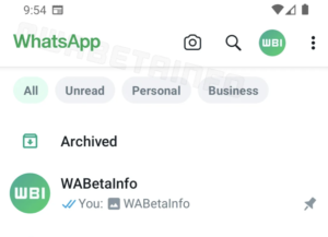
There are new chat filters at the top that will make managing your chats easier
As part of its 2022 brand identity revamp by DesignStudio’s London office, Sofascore – the most powerful sports app for live scores, results and stats – was in need of a bespoke sans serif type family that would act as a recognisable, ownable asset, and tie the brand together.
The standard way that the tech industry typically evaluates whether someone knows their stuff is through the all-powerful Portfolio. There are many definitions of portfolio, but generally, it means “a collection of stuff.”
Arial has served its purpose well over the years, but across this article, we’ll explore some alternative fonts that offer a more diverse range of characteristics, styles, and functionalities – certainly bringing something a little extra and a little special to your typography arsenal. The modern typographic landscape is shifting, and as the design world evolves, it’s time to explore out of your familiar aesthetic comfort zones.
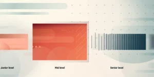
A few lessons to push your performance to the next level. You’re a few years in, definitely not the junior designer you used to be, and looking for the path to the next level. To get to the next level you’re often asked to “be more strategic” but still expected to execute the day-to-day tactical tasks. These are the things I wished I had known earlier in my career.
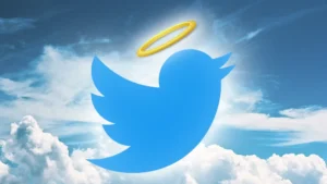
The paint isn’t yet dry on the Twitter rebrand to X, but people are gradually accepting that the blue bird logo isn’t coming back. Now one organisation wants to give it a new life. It’s asking Elon Musk to donate the late Twitter logo to a good cause.
Collected is a web design gallery which shows only eight sites, shuffled on every visit. Some sites may not be online anymore.
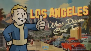
AI art remains hugely controversial, so you might think a company with Amazon’s resources would think twice about using it…. Or at least try to use it well. But fans are appalled that Prime Video’s first teaser poster for the upcoming live-action series Fallout not only looks AI-generated but also looks like nobody bothered to fix the mistakes.
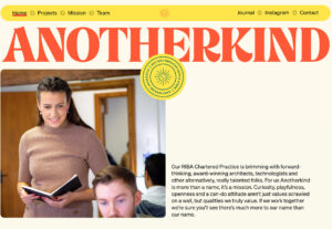
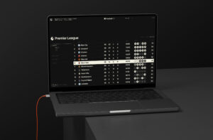
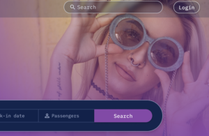
Trends in website design right now are offering a bit of a glimpse into the future with elements that are part of full website aesthetics, not small changes as we’ve seen a lot of recently. From monochromatic color palettes to magazine-style layouts to a shift in the way navigation is designed, there’s a lot to digest this month.
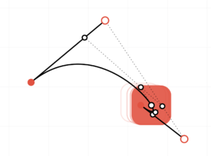
Bézier curves have been a recurring theme in my frontend engineering career. I have used them extensively in my work – in animations and SVG paths of illustrations and icons. However, I only recently took an interest in understanding the underlying logic that governs their behaviour.


