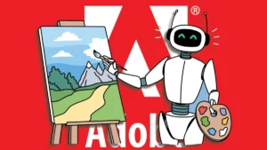
Why Adobe is frustrating web designers
A history of Adobe’s complicated relationship with the web.
A history of Adobe’s complicated relationship with the web.
Last Tuesday was the first class of my systems course. As I did last year, I asked students to envision their jobs twenty-five years from now. What will their work look like in 2049? What will they be doing? Not in vague platitudes: I wanted to know specifics.
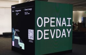
When OpenAI decided to host its very first DevDay – a one-day conference for hundreds of developers from around the globe – it began looking for an identity that would capture not just the forward-looking spirit of the company, but also this new venture that creates a space for a diverse pool of ta…
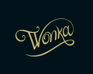
We caught up with Vernon to discuss the creation of the wordmark, and how it was inspired by Victorian style typography and involved frequent collabration with the studio.
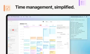
Meet Notion Calendar — integrated and synced with all your Google Calendar events.

Besides Dynamic Color support and the “new motion behavior,” there’s also now “higher contrast between track and active indicator to enhance the perception of progress.” These Material You progress bars also add an “end stop indicator to improve accessibility”:
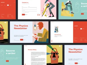
Our new case study unveils the project made at the crossroads of art and science: welcome to take a look at the creative process and solutions for Physica Magazine, the scientific blog wrapped in artistic, eye-catching, and functional web design by the tubik agency team.
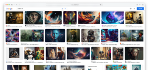
AI images are quick and easy to make. They look great at first sight, and they quickly replaced the use of stock images. But, like everything cheap and easy, they come with trade-offs. A short critique of the pure AI image.

To create a new proprietary shape, Pentagram and Itaú’s in-house design team pushed beyond the square, increasing the radius of the corner curves and rounding out the sides to make the form more organic and dynamic.