
Bring Interactive Prototypes into Design, Jam & Slidees
Today, we’re introducing the ability to embed Figma Make prototypes into Figma Design, FigJam, and Figma Slides, along with new editing tools that help you build and share your best ideas.
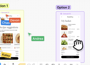
Today, we’re introducing the ability to embed Figma Make prototypes into Figma Design, FigJam, and Figma Slides, along with new editing tools that help you build and share your best ideas.

Like, remembered what you told it. Did real tasks. And messaged YOU when something important happened.
Picking the right WordPress plugins can make a clear difference in how your site works and how easy it is to maintain. In 2026, when tools, design trends, and online needs shift quickly, relying on strong, well-built plugins matters more than ever.
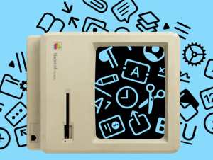
I was reading Macintosh Human Interface Guidelines from 1992 and found this nice illustration:

Hey there, we’re Ryan, Federico, and Robin, a trio designers who have noticed an undercurrent of change in the design world. AI is taking over software, and as it does, the demands on its designers are changing. AI is squishy and has a mind of its own, so designing AI-first products feels less like designing for print or HTML, and more like working with some kind of alien intelligence that crash-landed on Earth….
Most tools promise speed. The real change is precision — when AI can finally follow your design logic instead of guessing it.

Kyle Zantos is leading the new UX Tools Labs where he’s responsible for figuring out what matters for new design tools and workflows.
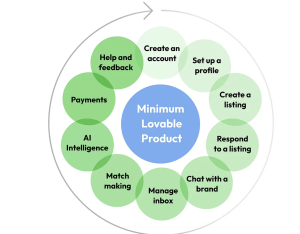
How we balanced speed and quality to build MTCHMKR, a consumer-grade SaaS product for brand partnerships
A look at how Dylan blends visual design, UX, and motion to build expressive, experience-rich websites, powered by tools like Webflow, GSAP, and curiosity.
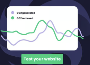
By late 2025, the internet’s greenhouse gas output is projected to surpass the aviation industry. If you are reading this, you likely already know that “sustainable web design” has graduated from a niche ethical preference to a central operational requirement.


