
The Impact of AI on Online Content Ownership
These days, large companies are trying to stake a claim. Social media has been doing this for years. And now artificial intelligence (AI) is putting the practice into overdrive.
These days, large companies are trying to stake a claim. Social media has been doing this for years. And now artificial intelligence (AI) is putting the practice into overdrive.
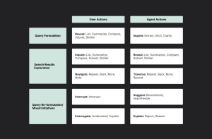
This in-depth guide takes you through the three crucial phases of conversational search, revealing how users express their needs, explore results, and refine their queries. Learn how AI agents can overcome communication barriers, personalize the search experience, and adapt to evolving user intent. Discover practical strategies and real-world examples to guide your development of intuitive, effective, and user-centric conversational interfaces.
In web design, a horizontal navigation bar is a fundamental element allowing users to navigate different website sections. Creating a sleek and functional navigation bar using CSS (Cascading Style Sheets) is relatively straightforward and provides a lot of flexibility in terms of design and responsiveness.
In this episode, Jake and Surma chat about web components. Why they were invented, what they’re useful for, and how they would improve.

Design is about understanding and solving user problems. It’s about making experiences simple, accessible, and easy to use. Google states that if we “Focus on the user, and all else will follow.”

It was 2015, and I was tired of losing arguments with customers about icon fonts. They were inaccessible, and error-prone, and they looked worse than SVG.

Despite outlining the urgency and the need for community involvement to keep the project maintained, proposing several options for the future of the project, and emphasizing the importance of maintaining or gracefully deprecating node-pre-gyp to avoid disruptions, it wasn’t resolved until very recently.
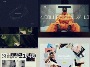
A fresh selection of motion design and animation inspiration from Dribbble.

Responsive web design (RWD) is an approach to web development that ensures a website’s layout and functionality adapt smoothly to various screen sizes and devices. Unlike traditional fixed or adaptive designs, responsive design employs a fluid and flexible layout that adjusts dynamically, providing an optimal viewing experience regardless of the device being used.
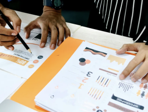
Imagine pouring your heart and soul into a product, only to discover later that nobody wants to use it. This is a real risk when you design without user research. By prioritizing what your users truly need, you can create solutions that are not only intuitive but also drive positive business outcomes.