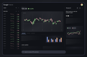
Flowbite Illustrations – Free and open-source SVG illustrations
Get started with 54 free and open-source SVG illustrations based on 3D styles, fully compatible with Flowbite and Tailwind CSS.
The goal of content design is to reduce confusion and improve clarity. Yet often it’s difficult to pinpoint a problem as user feedback tends to be not specific enough. But: we can use a few simple techniques to assess how users understand and perceive content. Let’s take a look. Part of Smart Interface Design Patterns by yours truly.
As designers, we often discuss the user experience of various products, covering aspects such as usability, aesthetics, and problem-solving. This is hardly surprising, as these are typically our main areas of responsibility. Without a doubt, they are key elements of user experience, but does UX begin and end with interactions that are strictly tied to using a digital product? Absolutely not.
Overview: UX and UI design are two interdependent roles in creating digital products. UX focuses on the structure and functionality, while UI enhances the visual appeal and interactivity. Together, they ensure seamless and engaging user experiences. This blog covers a detailed comparison of UX vs UI. It will help you understand these two roles and guide you in deciding which type of designer to hire for your next project.
Information architecture, or “IA” for short, is a term you may have heard of if you know anything about UX design. Information architecture is the discipline process of arranging and organizing data to make it readily searchable, accessible, and available for the intended audience.
Today’s Fintech disruptors and neobanks are igniting our brains’ reward centers with flashy visuals, gamified challenges and social interactivity that practically beg us to keep coming back for more. This is the effect of “Dopamine Banking,” where finance meets emotions and entertainment, and every tap of your smartphone is engineered to delight and reward. It ultimately changes how we think about financial services. Buckle up, because the future of finance…
Happy Monday! This week I’m sharing a short essay on some visual trends in digital design. Beneath our feet, the way that software looks and feels is shifting and I’m pulling a few threads to see what these changes might mean.
Product managers (PMs) live and breathe prioritization, constantly weighing trade-offs to deliver value. But one thing PMs should never sideline is user research (UXR). While analytics are great for telling you what happened, user research reveals why—helping you navigate product decisions with confidence and purpose, avoid costly mistakes, and maintain an evidence-based product strategy.
Aalto University’s Nokia Design Archive: A New Resource for Designers and Historians
We can highlight our software’s value in a number of ways: images, interactive widgets, motion graphics, talking-head walkthroughs, and live product demos—and I believe we’re really underutilizing the latter three. Because in my experience, these methods are incredibly effective at showcasing software features and helping users vividly understand their worth. Let’s explore some inspiring real-life cases to see how you can apply these value highlighters to your own products!