5 reasons your web design falls flat (& how to fix it)
Ultimately understanding your key users and responding to their needs and desires will lead to a site that is intuitive, logical, and delivers a user experience that will keep them coming back.
In this article, we offer to discuss the role of beauty in user experience design: let’s check how it makes both users and businesses happy.
The decentralized web is our new reality, but Web3 UX is shockingly bad. In this article, Pete Boyle addresses the major shortcomings in Web3 adoption and how we might be able to solve them and make the entire ecosystem more user-friendly.
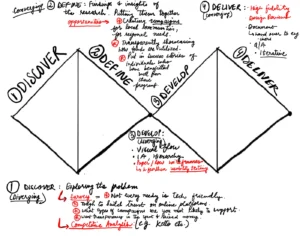
A redesign of Genie AI based on User insights and Analysis
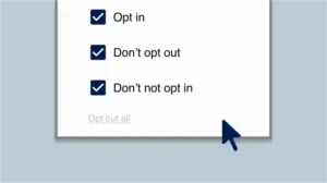
In this piece, a Web Content Accessibility Guidelines (WCAG) auditor shares some cookie banner error patterns that can massively hurt a page’s overall conformance. Let’s explore what to look out for with this omnipresent piece of the web interface.
Since the launch of Google Bard in its experimental phase, many UX professionals have been eager to try out this new tool and evaluate its ability to provide a high-quality conversational experience.
Simply put, the Z-pattern is a visual pattern that designers can use to guide users’ eyes and attention from the top left corner of a page (where most users start reading) down to the bottom right corner of a page (where the user is likely to take action).
I chose to redesign Slack, a popular messaging app, as my design project.
From the typography to the interactive elements, on Studiogusto everything is carefully crafted to create a seamless and visually stunning web experience. A clear winner this week!