The original bento box design?
Mac OS control panel, 1984. No labels or explanations, just controls.
Command-line interfaces have barely changed in decades, but remain beloved by techies. Warp aims to modernize the whole experience—and add a dash of AI.
The new changes are designed to align Spotify’s desktop experience with its mobile app. You can now explore, browse and organize your libraries like you do on the company’s mobile app.
Boosting e-commerce conversion with countdowns and the prisoner’s dilemma.
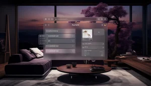
The guidelines, ‘Principles of Spatial Design,’ ‘Design for spatial interfaces,’ and ‘Design for Spatial Input,’ offer invaluable insights into how to approach AR design.
Let’s explore design trends in UI/UX design, the history of art, and typography in our in-depth post covering millennia of human creativity by our Lead Designer, Hrvoje.
UX writing lessons from an ugly encounter at a bank
So, you’re on the prowl for the best UI & UX feedback tools, and you’re not here to mess around. Great, neither are we. Let’s cut through the marketing fluff and explore some of the best tools out there to polish your digital product into a user-friendly masterpiece.
A collection of bitesized UX interactions, curated to inspire and help you tune into what great UX looks like. Updated every few days.