
Never skip research day
As UX designers, one of the most valuable tools in our toolkit is the skill to validate our design decisions with user research. It’s invaluable to making quality design decisions.
As UX designers, one of the most valuable tools in our toolkit is the skill to validate our design decisions with user research. It’s invaluable to making quality design decisions.
An interview snapshot is a way to organize your thinking as research sessions are happening, setting you up for smoother, less stressful analysis later on. There’s no wrong way to use it, and we have a customizable template to get you going.

Forms are already notoriously tough to customize and style — to the extent that we’re already starting to see new ideas for more flexible control. But what we don’t often discuss is designing good-form experiences beyond validation. That’s what Jima Victor discusses in this article, focusing specifically on creating multi-step forms that involve navigation between sections.
Organizational silos and product-centric design make it difficult to resolve friction for customers who use our products and services. User-centered design is applied to digital products, but many pain points in real customer journeys require solutions in areas beyond product-design improvement, such as marketing, tech, and customer support.
Psychologists studying the functioning of the human brain found out a long time ago that it has a tendency to take shortcuts and simplify tasks. By nature, our brain just doesn’t want to fatigue itself. This is especially true today when many of us experience cognitive overload. A brain overwhelmed with too much information it can’t process effectively tries to find a way to make things easier. The result? Cognitive biases.
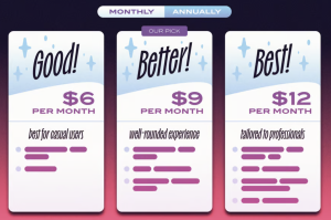
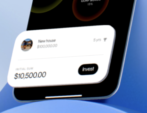
From the big names like Netflix, HelloFresh, and Amazon Prime to the more niche ones, like car features unlocked by a monthly fee or olive oil delivered to your door — companies are leaning into subscriptions over single purchases, and it’s easy to see why. The model provides predictable revenue, fosters loyalty, and builds long-term relationships — all driving profitability.
The world of UI/UX design is constantly evolving, and as technology advances, so too does the role of Artificial Intelligence (AI) in this field. With AI becoming more integrated into design tools and processes, designers (like you and me) are poised to experience some major shifts — both exciting and a bit unnerving. But before you start worrying about robots stealing our jobs, let’s dive into how AI is shaping…
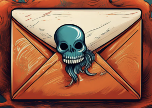
Collaborating remotely and working with digital assets is just another part of graphic designers’ and creatives’ daily routine. However, relying on digital tools exposes designers to various cybersecurity risks that could put their projects, assets, and sensitive client information in danger. Recognizing certain cybersecurity red flags early on is important so your work and client data are always secure.
When exploring customer acquisition cost optimisation strategies for digital products, we often overlook the most fundamental element: the user experience itself. This oversight leads to a critical gap in our understanding of true acquisition costs.
10 AI-driven Features That Will Revolutionize Banking UX. Discover how AI technologies transform banking UX and open innovation opportunities.


