Mastering Shadows: Fix Common Mistakes
For all digital designers who design interfaces: are you happy with those gray shadows you’ve been slapping on your designs?

For all digital designers who design interfaces: are you happy with those gray shadows you’ve been slapping on your designs?
The world is naturally painted with color, from the greens of the trees to the blues of the ocean. Think of the emotions you feel when looking at a rainbow or a sunset during the golden hour. The harmony of colors in nature often inspires many of the color schemes we use in the digital world.

I have somewhat magpie-like tendencies: strange or beautiful objects catch my eye as I move through the world and often end up on a shelf or window ledge in my flat. I’d like to try and convince you that a little bit of hoarding can help us design better things.

Dribbble’s mission is to help professional designers earn a living doing work they take pride in.
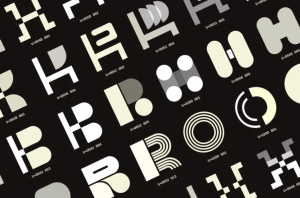
In the sprawling cosmos of design, typography holds a unique gravitational pull. It influences emotions, communicates intent, and can make or break a visual identity. The act of selecting, designing, and pairing typefaces can be daunting, but it’s also where the magic happens. Trusting your gut, embracing experimentation, and understanding the emotional power of type can transform a simple project into an unforgettable experience
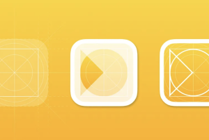
Icon design is always a balance between clarity, simplicity, and visual appeal. This article shares key practical UX and UI recommendations to help guide the icon design process.
I’ve been working on my portfolio website to showcase my work, and I wanted it to stand out with a touch of personality.
Escape siloed design and engineering processes and speed up your product development by using code as your single source of truth. Let’s explore how.
Design system naming conventions are the standardized rules and guidelines used to name elements within a design system. This includes naming design tokens, components, patterns, styles, and any other elements that are part of the design system. A well-defined naming convention is crucial for maintaining clarity, consistency, and ease of use across both design and development teams.

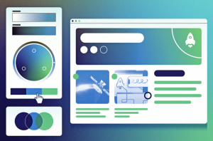
Use these hero sections built for e-commerce websites as the storefront part of your homepage where you can add CTA sections and show promotions to increase conversion rates