
How Designers Are Really Using AI
Learn how UX and product designers are adopting AI—from tools and workflows to challenges, impact, and predictions for the future of design.

Learn how UX and product designers are adopting AI—from tools and workflows to challenges, impact, and predictions for the future of design.
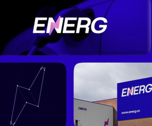
Logos stayed fixed, color palettes were locked down, and typography rules were carefully controlled to avoid variation.
Creative ideas don’t always arrive fully formed — often, they take shape through exploration, trial and error, and refinement. That’s why we designed Adobe Firefly as an all-in-one creative AI studio where creators can work with the industry’s leading AI models and powerful creative tools, all in one place, to move from idea to finished work.
With our new AI image editing tool, Vectorize, you can turn raster images into editable vectors, allowing you to tweak, refine, and scale designs directly in Figma.

In practice, the hard part isn’t writing code, it’s everything that comes before it. Which component should be used? Which props are correct for this case? How does this behave with keyboard navigation and screen readers? What tokens to apply?
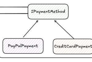
Every software engineer has seen something like this happen: you write a feature, ship it to production, and everything works great. Then, a few weeks later, you get different requirements. You have to support a new use case, but you find out that your code is not ready.
It’s 2026, and if you’re thinking of switching up your design tool, we figured it was a good moment to reintroduce ourselves.
What is the price of the ‘human touch’ in creativity? Brands are deciding whether to choose ‘real’ or artificially generated content, and audiences are weighing in. For some, the proof is literally in the process – which means behind-the-scenes content is no longer optional.
Coming up with strong ideas has never been the problem. The real challenge starts when those ideas need to be shared, discussed, and aligned, long before anything is produced. Today, designers are expected to orchestrate experiences across screens and physical products, balance creative ambition with sustainability goals, and collaborate seamlessly across disciplines that once barely spoke the same language. For many designers, especially those working in branding, packaging, and product…
A comprehensive guide to design system engineering (DSE): when it’s relevant, how AI changes things, and pointers for getting started. From Michael Abernethy, Principal Frontend Engineer at Rubrik


