The Freelance Advantage: Turning Website Fixes into Opportunities
For years, freelance web designers have been encouraged to book new projects. It’s how I built my business. I’m betting that many more have done the same.
New products can still thrive in crowded markets, as demonstrated by companies such as Linear, Loom, and Superhuman. How do they achieve this? Often, it’s due to exceptional design tailored to a specific niche. Here’s the story behind our approach at Hellotime, where simplicity and speed are our guiding principles.
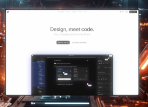
Figma, the popular collaborative design platform, recently announced it is also getting in on the AI hype train. The company’s latest move will also involve leveraging user-generated content to train its AI models, a decision that was somewhat expected to happen.
With design tools further commoditising and sanitising expected creative output, the time for designers to be able to stand out is very much here. I think for some, learning to code is a good route for that.
A practicing Muslim BIPOC Designer feels a sense of belonging and pride showing up unequivocally as herself.
When we think about the most impactful designs, whether in print, web, or user interfaces, we often notice a balance and harmony that makes the design attractive and functional. This balance is rarely achieved by accident. Behind these aesthetically pleasing and functional designs lies a powerful tool: the grid. While grids are merely tools in a designer’s toolkit, their power in creating structured, consistent, and user-friendly layouts cannot be overstated….
The Sonos Ace design story begins with Marcel Breuer’s Wassily Chair. Representing an idealized balance between contrasts – soft with hard, simple and complex, machined versus the human body – the iconic Bauhaus modernist design offered the Sonos design team a perfect aesthetic and functional template for designing what would become the brand’s first headphones.
Hello! This week we’re stepping back to review some of the most interesting ideas about design that we’ve heard over the past few months.
The design purity trap is the belief that as a designer you should always be evaluated on your creative talents and everything else is secondary. A design purist rejects the need for designers to be good communicators or to learn how to sell their ideas as these things are not “pure design.”
Today we evaluate Otilia Oandelea’s portfolio and UX work. Otilia is a UX & product design intern with 2+ years of experience and finished the Google UX Design Professional course in 2022. Despite being entry level designer, the portfolio is presented really well. I will show what UX recruiters and UX hiring managers look for when evaluating such a portfolio using emojis to indicate my emotions.