Design stories

Why KIA’s confusing logo is part of a growing design trend

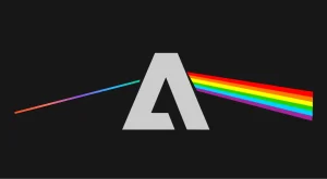
Kia has a logo problem: namely, that people can’t quite read it. The recent revelation that the company’s new logo causes 30,000 people a month to Google “KN car” sent the design world into a minor tizzy, resulting in a number of proposals to “fix” the logo by restoring the missing crossbar to its “A.” This unimaginative, too-literal approach

How to make UI color palettes

Creating a UI color palette can sometimes feel a bit complicated and messy. But I’ve developed a systematic, efficient method for making a color system. In this video, I run through the 5 steps I use (plus a few extra tips for working with color)!

Avatar producers finally break silence over THAT logo

Avatar The Way of Water, the sequel to 2009’s Avatar is released today. It hasn’t exactly received rave reviews. But one thing it tried to put right was to update the franchise’s logo, which became one of the most mocked logos in film due to its use of the off-the-shelf typeface Papyrus.

Does Your Product Actually Need Dark Mode?

If you’ve been building apps and have been around for a few key moments – say circa 2018-2019 – you might recall the current thing of those times, the dark mode. That’s when both Apple and Google decided to introduce their versions of dark mode during their annual WDDCand I/O conferences. It didn’t stop (or start) there though. Most major players in tech sprinted to replace the traditional blinding white…

Design Systems 101: An Introductory Guide for UX/UI Designers

A design system is a collection of principles that govern the design of a brand’s digital experience. It provides a set of guidelines for how your brand should look and feel across all channels and devices. When done correctly, using a design system can have many benefits for your business or organization — from improved communication and efficiency to more consistent branding across all digital channels.

ExtendImage.AI – Extend your images with generative AI

ExtendImageAI is a website that allows you to extend the borders of your images with artificial intelligence. All you have to do is upload an image and the artificial intelligence does the rest!

Design System Maturity Levels

This article is based on a talk I gave at the DesignOps 2022 Conference where I discussed 5 levels of design system maturity. I’m here to tell you that building a UI library is a lot like launching and scaling any other product—except this product is internal to your company.

Behold, the dreadful new Twitter Blue logo

The official Twitter Blue account (which features a yellow verification badge, lol) has updated its header photo to the new logo, which can only be described as 1980s meets Microsoft Word Art, plus bad kerning. Yep, like Twitter itself right now, it’s just a bit of a mess

The big box of magic

In 1989 the British rock band Queen released their thirteenth studio album. The REALLY interesting thing was that, at this point, Photoshop had not yet been invented. Richard Gray was lucky enough to be able to have a go on a new piece of technology, a system designed and built by Quantel, a British company, founded in 1973, that designed and manufactured digital production equipment for broadcast television, video pr

TikTok still can’t get over that terrible Hershey’s logo redesign

Yep, the eight year-old rebrand is still getting laughed at online, thanks to the logo’s unfortunate resemblance to a certain emoji. And seeing as the company has held its nerve and clung onto the design for nearly a decade, we’re not surprised. (Looking for design inspiration?

1 2 173 174 175 176 177 183 184

Submit an article

You can submit new articles related to web design / development, UX, apps and graphic design. No homepage submissions, no spammy affiliate links will be accepted.
Title
URL

Thank you!

Thanks for submitting your story. We will review it and approve it if relevant.