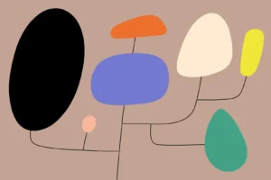
LogoGratuit – Free do-whatever-you-want logos
Explore dozens of free logos, use them immediately and without limits. Created by a professional designer, our logos are perfect for Gaming, Fitness, Artificial Intelligence or Fintech projects.

Explore dozens of free logos, use them immediately and without limits. Created by a professional designer, our logos are perfect for Gaming, Fitness, Artificial Intelligence or Fintech projects.
Design Manager Juli Sombat sheds light on how a need for more cohesion led Spotify’s design systems team to take a cross-platform approach to components.

Transitioning from a designer to a design leader requires a shift in mindset, as well as the development of new skills and competencies. It requires an understanding of the unique challenges that come with managing a design team and communicating with stakeholders, as well as the ability to build a strong team culture and lead by example.

A cleaner design, bringing it closer to others in Google’s ecosystem.
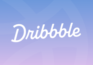
At Dribbble, we have always believed in the power of great design. We decided it was time to refresh the design of our logo to better represent Dribbble’s energetic, diverse community and our resolve to continue our growth story as we build the world’s destination to hire top design talent. This significant brand change marks a pivotal moment for us as we continue to evolve and enhance our platform to…
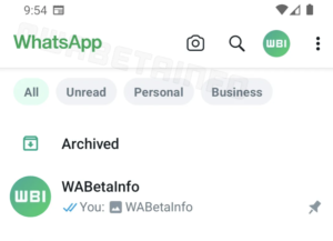
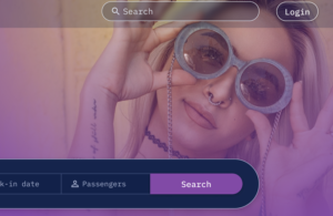
There are new chat filters at the top that will make managing your chats easier
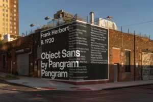
As part of its 2022 brand identity revamp by DesignStudio’s London office, Sofascore – the most powerful sports app for live scores, results and stats – was in need of a bespoke sans serif type family that would act as a recognisable, ownable asset, and tie the brand together.
The standard way that the tech industry typically evaluates whether someone knows their stuff is through the all-powerful Portfolio. There are many definitions of portfolio, but generally, it means “a collection of stuff.”
Arial has served its purpose well over the years, but across this article, we’ll explore some alternative fonts that offer a more diverse range of characteristics, styles, and functionalities – certainly bringing something a little extra and a little special to your typography arsenal. The modern typographic landscape is shifting, and as the design world evolves, it’s time to explore out of your familiar aesthetic comfort zones.
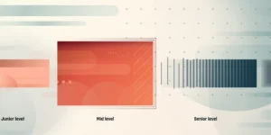
A few lessons to push your performance to the next level. You’re a few years in, definitely not the junior designer you used to be, and looking for the path to the next level. To get to the next level you’re often asked to “be more strategic” but still expected to execute the day-to-day tactical tasks. These are the things I wished I had known earlier in my career.