Unstock.ai
Free custom stock images & illustrations on-demand. For your website, book, social media and more! Powered by the world’s most creative image generation AIs.

Free custom stock images & illustrations on-demand. For your website, book, social media and more! Powered by the world’s most creative image generation AIs.
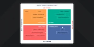
Building support for design systems by framing their benefits for reluctant designers, engineers, and PMs

This website takes you to the time when Google was just an infant
In a bid to pay homage to all the iconic bird logos that are still part of modern culture, here are 24 bird-centering design identities that are global, endearing, and beautifully designed.
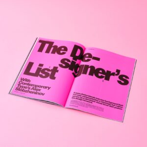
Sit back, relax and reacquaint yourselves with the joys of devouring a beautifully designed print magazine. We present a selection of the best titles on sale today.
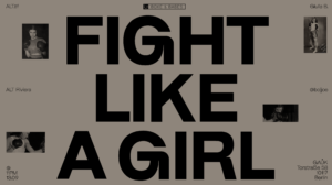
ALT.tf’s website just got a HUGE new update! Equipped with a number of fantastic features, you can also find a healthy new font release in collaboration with London-based type designer Giulia Boggio
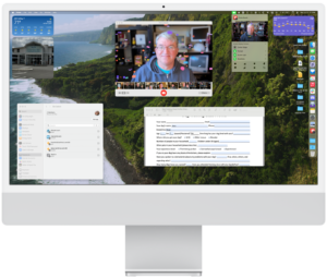
macOS Sonoma is an update that feels small—but in all the best ways. Upgrading it won’t change how you look at your Mac, at least not at first. This means that if you’re desperate for change to longstanding features of macOS, you will not find what you’re looking for in macOS Sonoma. I suspect, however, that most Mac users just want incremental improvements without disruptive changes. Slow and steady wins…
From September to December 2022, I had an opportunity to do an internship at Microsoft as a Visual User Experience Designer with the Nuance Customer Engagement R&D team. In this article, I would like to share key takeaways that I have learned from being a part of a fantastic team.
A checklist for making good type decisions for user interfaces
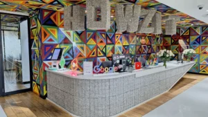
From our AI research center in Ghana to our beehives in the Googleplex, take a tour of our offices and data centers around the world.