Svgmix – 300K+ Free SVG Icons, Collections, and Logos
SVGmix is a massive (300K+) collection of free SVG icons and brand logos.
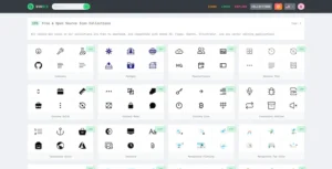
SVGmix is a massive (300K+) collection of free SVG icons and brand logos.
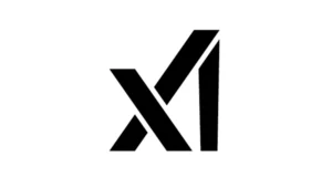
The new company already has a logo, and it’s causing quite some debate. While some are admiring the simplicity with which it represents xAI’s name in just three straight strokes, others think it’s a botched job/

We’ve seen what Barbie’s house would look like in every US state, but now, let’s take things international. Here are 13 iconic landmarks from around the globe after being given a Barbiemakeover:

Urban planners have been designing for human experiences for nearly 200 years, UI/UX designers can learn from this
How designers have succeeded and failed in our daily lives
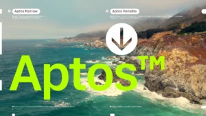
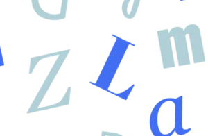
Introducing Aptos, our modern successor to Calibri
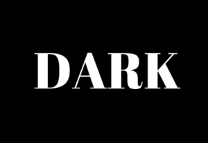
This comprehensive guide aims to provide web designers with valuable insights, best practices, and considerations for mastering dark mode design and delivering an exceptional user experience.
The dark horse social network wants to attract the users Twitter and Reddit might be losing — and to do that, it says it needs to be easier to use.
Adobe seems to be cracking down on employees using artificial intelligence (AI), including restricting workers’ abilities to sign up for services with their personal emails.
See how fonts change the way you read and write.