Test often to keep your designs simple
Rather than use the most complicated design first. The key is to try the simplest thing to build and get going. That way if you don’t need to build on more things, you don’t.

Rather than use the most complicated design first. The key is to try the simplest thing to build and get going. That way if you don’t need to build on more things, you don’t.

Technological and “intellectual” limitations that secure our roles as Product Designers for the foreseeable future.
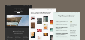
A behind-the-scenes look at Twenty Twenty-Four, the most expressive and capable WordPress default theme yet, alongside WordPress 6.4.
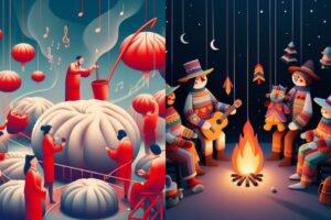
This year, Microsoft is looking to celebrate the holiday season—a time of diverse traditions and unique memories—in a novel way with the help of artificial intelligence. The technology giant has invited individuals to share personal holiday stories to be transformed into digital art through the power of Microsoft Designer.
2023 is almost over, and the new fonts are still coming thick and fast. This month, we’ve found some awesome variable fonts, some revivals, and one or two novelty fonts to get you through the holiday promotion work. Enjoy!
NBC News Now, NBC’s free news streaming service, has switched its logo to the proprietary font that’s slowly spreading to all realms of the peacock network.
It’s time to put creativity back into design again

The result is a list of 200 groundbreaking inventions (and 50 special mention inventions)—including the world’s most powerful supercomputer, a game-changing entertainment venue, and a new shape—that are changing how we live, work, play, and think about what’s possible.

Are you looking for the perfect gradient or a seamless transition between two colors? Our new tool, Colors in Between, is here to revolutionize the way you work with color gradients. Whether you’re a graphic designer, a digital artist, or just someone who loves to experiment with colors, this tool is designed to spark your creativity and simplify your color decisions.
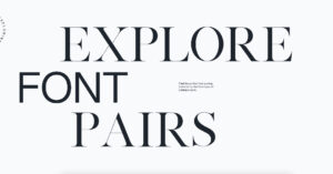
Monotype, the world-famous type foundry, is making the decision process less stressful for designers with a Font Pairing Generator. Powered by artificial intelligence, the tool is designed to assist creatives in their search for the perfect font duo.