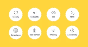
Designing an Intuitive Mobile Dashboard UI: 4 Best Practices
Use these tips for navigation, tables and charts, button UX, and interactivity to create a smooth mobile dashboard experience that will keep users coming back.
Each frame of the label’s latest animation was drawn in a “competitive speedrun” by Cha Chaan Teng’s Wei Prior and Char Alice.
Proud to finally announce our work for @CocaCola, in collaboration with @MrCraigWard, to re-imagine their iconic logo for the next 131 years. Coming soon to a can near you…
“They’ve created a way to stop Adobe Illustrator users creating things in Adobe Illustrator.”
A new ‘icon of transparency’ is here to certify real images and brands from forgeries and AI creations. It has high-profile partners and corporate buy-in—but also a slew of challenges.
How far would an organization be willing to go for the chance to generate a little extra buzz? In this list, we’re going to find out….
Its Dropbox AI tool is also expanding to cover more content, and there’s a new Dropbox Studio feature for managing video projects.
Prioritizing user experience and functionality has reshaped how we approach software creation, leading to the rise of design-driven development (DDD). This approach isn’t about aesthetics–it’s about understanding, empathizing, and delivering solutions that resonate with end users.
According to Adobe, the Firefly Image 2 Model, as it’s officially called, will be better at rendering humans, for example, including facial features, skin, body and hands (which have long vexed similar models).
DALL-E 3 is great for making movie posters. We tried to recreate some of the best know moves posters and here is the result…