ColorHub – The new best site on the web for finding and testing colors
ColorHub is a site where you can seamlessly flow and test colors with ease, helping you find the right one to pick no matter what you need it for!
The Tata-backed Full Service Carrier (FSC) has recently rebranded its website from AirIndia.in to AirIndia.com. Subsequently, they will soon reveal the New livery, which according to our source, will be the same as shown in this article.
Brilliante is a versatile new typeface with personality, perfect for designers who demand creative freedom. A two-axis design opens up the possibilities for projects with moods ranging from meticulous to flamboyant. Across the collection of 15 styles, Brilliante’s curves add refinement and grace, while sharp, short serifs deliver an edge.
Tata Group-owned Air India is likely to change its livery colours, which is likely to be revealed at an event on August 10. The current logo of Air India, in use since 2014, shows a red swan with the orange Konark Chakra image on it. It is also displayed on the tail of Air India’s aircraft.
A collection of Figma plugins for everyday design tasks — from finding good font pairs to creating responsive design. Most plugins in this list are available for free.
This article is based on Marcel’s Into Design Systems live titled “The Power of Design, Code & Ai in Design Systems.” We have summarized Marcel’s talk into its key points, but you can watch the entire 3-hour webinar here.
Even the most extensive toolbox needs a refresh from time to time, so we’ve rounded up a selection of new tools for you to try.
In 2023, typography promises to kindle dialogue and action from us. Graphic design history has been written primarily by straight, white men of European descent for so long. “This idea of empathetic type is very real,” says artist, designer, and educator Jon Key. “As people who are more diverse and have different backgrounds start to get more power in various institutions, there will be narrative change, of course.”
Rebranding Twitter to X removed the last bit of joy from this platform by butchering its visual identity. Is the new logo only a Unicode symbol, or probably just taken from an actual font? In this post, and video, I’ll dive into the details, while showing you what you should pay attention to, when choosing a font for your next logo.
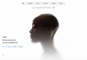
A cool futuristic design with so many interesting details and animations that will make you enjoy every bit you scroll.