
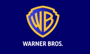
Warner Bros. logo gets a thicker, bolder, and sharper look
The design team has stripped off the Warner Bros. Pictures Inc. banner on the middle of the shield and ushered in thicker, bolder, and sharper details of the curvature and letterforms of the shield and the capital letters ‘WB’ in an attempt to retain the classic, recognizable look of the logo while adopting a chunkier and more sleek style.
