
Designing in Public, Thinking Long‑Term
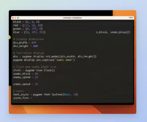
Eugene intentionally doesn’t show up on Dribbble as a solo act. As a Design Lead at Shakuro, he has spent years working on collaboration, experimentation, and shared visual thinking across a global agency. From product interfaces to concept-driven explorations, a lot of what you see on Shakuro’s Dribbble isn’t about spotlighting one designer; it’s about representing how the team thinks, builds, and evolves together.


