Best Data Visualization Projects of 2022
Every year I pick my favorite data visualization projects, which tend to cover a wide range of purposes, but generally speaking, are typically for presentation. Here are my favorites for 2022.
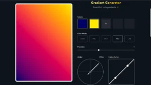
A set of modern, responsive CSS components that you can use in your web and app projects.
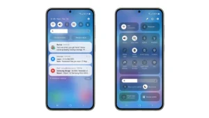
The issue involved how the battery in the top-right corner of the screen looked when users opted for the setting to display the exact percentage of the battery remaining, rather than the default which only showed a visual representation of the battery level.
If you review the UX content and discourse from any year, you will find some consistent topics. Education about the value of good user experience, current best practices, methodological how-to guides, and reviews of software and tools are typical any year. Beyond this, every year has its defining movements and topics.
A project brief was provided to me that included basic research insights, a description of the brand, the problem at hand, and a sample of pre-existing wireframes. My specific role included…
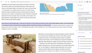
Unlike the fixed size of a magazine page, a screen layout changes dynamically with the size of a browser window. Still, the typography must look good and readable at any size the user wants.
The ViewFinity S9 offers the same size and resolution as Apple’s Studio Display in a similarly stylish design. And you don’t have to pay anything extra for its anti-glare finish.
Here are some things I’ve said to gain an extra $40,000 while negotiating with a public company.
A carbon emission calculator that takes into account the power consumption of device and server during browsing a web page.
Leading designers, artists, and technologists share what they want to see happen in 2023.