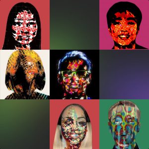
100,000 humans that don’t exist
Super realistic whole-body images. Use them wherever you want and don’t worry about legal stuff.
Super realistic whole-body images. Use them wherever you want and don’t worry about legal stuff.
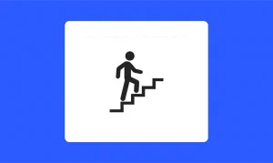
What happens during the first experience can make or break any app. To ensure users don’t delete your app after the first try, you must successfully onboard and engage them during the first interactions.
Logo design trends are something mythical: almost everyone speaks and writes about them. But have you ever seen them in action? While so many creators are building up their tips on how you should better approach logo design, we’ve decided to check up what real businesses do and sum it up as nine major logo trends that will probably work in 2023.

Delight can be experienced viscerally, behaviorally, and reflectively. A great design is supported by all three of these pillars and is best evaluated with specific research methods.

In terms of sheer impact, the like button was one of the most successful pieces of code ever shipped. But when you examine the quality of that impact, its flaws become glaring.

As UX writers, we have the power to turn a user’s mistake into a positive experience with just a few words. Here’s how.
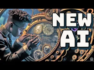
The largest AI tools directory – daily updates on new AI tools! A directory that’s easily sortable and filterable. Futurepedia only had 150 tools at its inception, and now has over 250 tools and is growing rapidly!
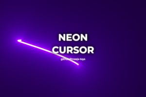
Custom cursors are a great example of progressive enhancement in design. You start with a simple user interface (UI) for small, touch-based devices. From there, larger devices offer an opportunity to include more bells and whistles.
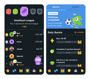
The world’s largest language learning platform recently rolled out a major update to its 50M active monthly users. The new “path UI” aims to simplify the learning experience, but it comes with some major usability flaws.

If you are a journalist, chances are you have a lot of deadlines, work on a tight schedule, and looking for a way to make your research process easier and faster. HARO might be your best option if you need high-quality sources to complete your story as soon as possible.