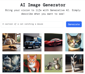
Build an AI Image Generator with JavaScript and DALL-E 3
In this tutorial, we will build an AI image-generation app with JavaScript. Users will enter text describing the image they want, then we will call the DALL-E 3 API to generate the image!
In this tutorial, we will build an AI image-generation app with JavaScript. Users will enter text describing the image they want, then we will call the DALL-E 3 API to generate the image!

With the hyper-growth phase our studio has undergone, it was crucial that our website reflected our values and our distinctive model.

“GPT-4o could evaluate video transcriptions and captioned scenes with such precision that the chapters it identified seemed as though a human had curated them. The context was clear, the topics were relevant, and the overall quality of the clips soared.”
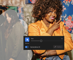
Today we deliver ground-breaking generative AI technology to Lightroom with Generative Remove, powered by Adobe Firefly. Now any photographer can make distractions disappear in a single click and get high-quality results in seconds with our most powerful removal tool yet.

Hitting “publish” on a new webpage or major update is exciting, but there’s a nagging fear… Did you miss something? Little mistakes can seriously impact website visitors.
How would you describe an ideal user research process? What are the key research methods, and when should they be used in product design?
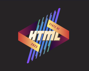
We just published the results for the first-ever State of HTML survey, the results of months of hard work not only on my part, but also from Lea Verou, who designed the survey questions, and many volunteers helping out with translation, accessibility, testing, and much more.
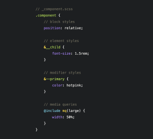
A lot of new CSS features have shipped in the last years, but actual usage is still low. While there are many different reasons for the slow adoption, I think one of the biggest barriers are our own brains.
The World Games is an international multi-sport event usually held every four years.
Almost all interaction methods have a “press” and “release” event associated with them. Whenever possible, you should “do the thing” when you get the press event instead of waiting for the release event, because it makes the interaction feel substantially more responsive, and it reduces user errors by not allowing the focus to slide out of the hot box between press and release.