
Trust Is a Cultural UX Problem: Why Indian Users Doubt Everything
Users form impressions in milliseconds — way before their brain can think logically. Your design sets the mood, sure. But their cultural memory? That’s what controls the reaction.

Users form impressions in milliseconds — way before their brain can think logically. Your design sets the mood, sure. But their cultural memory? That’s what controls the reaction.

It seems like everyone has a spam story or two to tell. And we’re not talking about in a lifetime. No, spam is an everyday nuisance and something we live with.

Exploring how experimenting with Three.js, React Three Fiber, and GSAP shaped the final experience.

CAPTCHAs were meant to keep bots out, but too often, they lock people with disabilities out, too. From image classification to click-based tests, many “human checks” are anything but inclusive. There’s no universal solution, but understanding real user needs is where accessibility truly starts.

It feels like the year just started, yet somehow it’s already winter. So much has happened, it could’ve been five years in one. Change, motion and only a few rare moments to just stop and take it all in.

The project began with designing a clean, minimal logo that would reflect both precision and trust—qualities that are essential in the medical field. Alongside the logo, we developed a set of patterns and visual assets to create a cohesive identity system.

We think of these as post-category brands – products whose purpose aligns with a familiar category, but whose materials or methods have moved beyond the conventions that once defined it.

At Figma, we believe AI’s role is to help teams explore and imagine more. Every new model we bring to our platform gets evaluated through the same lens: Does it implement your designs with accurate fidelity? Does it take more of the busywork off your plate? Will it expand your team’s creative possibilities?

What It Is: New Relic combines Real User Monitoring (RUM), Application Performance Monitoring (APM), and infrastructure observability in one unified platform. Whether you’re tracking a JavaScript error originating from a slow backend API or monitoring Core Web Vitals across thousands of sessions, New Relic connects frontend performance to backend context in real time.
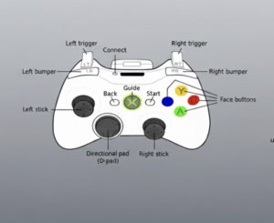
Debugging controllers can be a real pain. Here’s a deep dive into how CSS helps clean it up and how to build a reusable visual debugger for your own projects.


