Does Google Maps has a bad UX?
As part of an UX/UI challenge in my class, I have to cleverly redesign a part of an application of my choosing.
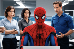
AI-powered text-to-image tools are presenting a moral quandary in terms of creative ethics. But is there a way to use such tools while expanding artistic potential?
Most UX newbies only learn these design skills at work.
Some logos, wordmarks, and icons are so universally identifiable we might take them for granted. We lose sight of the fact that these designs often started from humble beginnings, with a human taking pencil to paper and dashing off a quick sketch. NASA’s “Worm Logo” is right up there with the best in this category.
One will see Google personalizing search results for users by allowing them to “follow” topics of interest in addition to surfacing web pages in new ways. Another, more experimental initiative, will turn Google into a collaborative space where users can annotate web pages with their own notes, which are browsable by anyone else on the web.
Helvetica’s beauty is in its neutrality, so why not go weird with it?
Apple’s iMessage continues to reserve encryption and other features for iPhones to the detriment of all mobile phone users.
As the nights draw in for the Northern hemisphere, what better way to brighten your day than by soaking up some design inspiration?
YouTube today announced how it will approach handling AI-created content on its platform with a range of new policies surrounding responsible disclosure as well as new tools for requesting the removal of deepfakes, among other things. The company says that, although it already has policies that prohibit manipulated media, AI necessitated the creation of new policies because of its potential to mislead viewers if they don’t know the video has…
Brand identity for Transport for London’s growing property company.