Fitbit app gets a major redesign with an emphasis on simplicity
It’s in beta now with an official release coming this fall.

It’s in beta now with an official release coming this fall.

Wix Studio offers freelancers and agencies the opportunity to scale their businesses and take on more clients
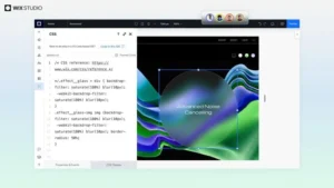
Wix Studio marks a significant evolution in web creation for agencies, delivering a revolutionary platform that combines AI-powered features, the latest design and development capabilities and seamless workflows for multi-site management to help agencies create projects with greater quality and velocity
Over the decades, different OSes have added different tools and workflows to deal with these issues, including workspaces, taskbars, and switchers. However, the basic primitives have not changed since the 70s and, as a result, the issues have never gone away.
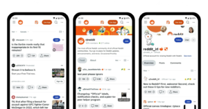
Reddit is rolling out a number of updates to its website for logged-out users, including improved performance, a more helpful search results page and better communities and related post suggestions.
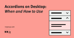
While accordions can simplify long content pages and minimize scrolling, they diminish content visibility and increase interaction cost. On desktop, use accordions for content-heavy pages where users will not need to access content under several accordions.

Smaller images, animation, and plenty of wild patterns are what you’ll find in this website design trend that’s popping up all over the place.
Gotta love this design! It has so much personality and a unqiue vintage touch, the perfect fit for the brand it represents. Amazing work by Thom Aufresne with lots of lovely micro interactions.
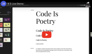
WordPress 6.3 ships on August 8th! For a sneak peek of what’s to come, members of the 6.3 release squad, Anne McCarthy and Rich Tabor, held a live demo moderated by Nathan Wrigley.

In this post, we’ll delve into the world of SVG gradients and explore the solution we devised to tackle the challenges that arose, and argue why sometimes, being given complex engineering challenges like this can be highly rewarding.