Web Design stories

Butternut AI Beta – Build websites instantly using generative AI

Butternut.ai helps you build a fully-functional website in under 20 seconds without writing any code. Think Wix or Webflow, but with generative AI. Enter your business name and keywords, and get a stunning website with images and copy in seconds.

UI Interactions & Animations Roundup #30

A fresh collection of Dribbble shots featuring trendsetting creative animations and motion designs to fuel your inspiration.

Walmart’s new website design might look familiar to Amazon users

Walmart unveiled a new website and app homepage that features glossy photos and live videos. Its new website and app represent its latest move to try to gain ground on rival Amazon.

Collective #758

OKCC Labs has a fantastic design, showcasing a fusion of a vibrant main color, innovative 3D scroll animations, and sleek design elements that come together to create a truly joyful user experience.

Case Study: Garden Gates. Brand Identity and Packaging Design for Garden Center

The logo design for the project presents the combination mark in which the symbol echoes botanical motifs elegantly organized in a square shape, and the typographic part sets a strong visual connection with it using the same leaf shape as a part of the letter.

Collective #757

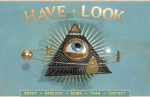
Decimal is a sharp website with a brutalist intro and visually stunning hover effects in their Works section, making it our inspirational website of the week.

Canva gets a massive upgrade with new branding features and AI tools

In today’s Canva Create presentation, the platform will unveil a ton of new branding features and AI tools showing that it aims to become nothing less than a one-stop shop for brand managers and creative teams, covering almost every communicational need…

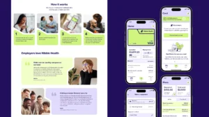
Case Study: Nibble Health. Identity and UX Design for Healthcare Fintech Service

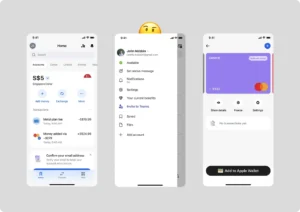
Check the creative story of brand identity and UX design for NibbleHealth, a healthcare operating system, effectively eliminating financial barriers to great care.  

Designing the Overlooked Empty States – UX Best Practices

Empty states are a pause, not a dead end. Whether a user stumbles across an empty state due to first-use, accomplishment, or error, your product needs to guide them to the next logical step.

Mind the AI gap*

UX keeps learning and working with AI tools to recognize any opportunity.

1 2 35 36 37 38 39 47 48

Submit an article

You can submit new articles related to web design / development, UX, apps and graphic design. No homepage submissions, no spammy affiliate links will be accepted.
Title
URL

Thank you!

Thanks for submitting your story. We will review it and approve it if relevant.