
The Sweet Spot for Design System Work
There’s a narrow window for effective design system work. It sits squarely in the center of a spectrum that’s too easy to slide towards one end or the other.

There’s a narrow window for effective design system work. It sits squarely in the center of a spectrum that’s too easy to slide towards one end or the other.
This article will explore the most common navigation practices in the market as of the end of 2023.

Whether scroll fading is more distracting than usable depends on the following factors: its persistence, responsiveness, and how sparingly it is applied to elements on the page. When used right, this design pattern can improve brand perception, optimize page loading, and make content more digestible.

Design has entered a new era, and so has the Design Tools Survey. We take a first look at how tools are evolving with the use of AI, which we’ll continue to watch year over year. We appreciate our community and their participation this year, as always! The raw data is freely available for download.

In the digital world, especially on the web, we’re used to things being stacked vertically. Scrolling, scrolling, through boxes of content…
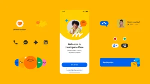
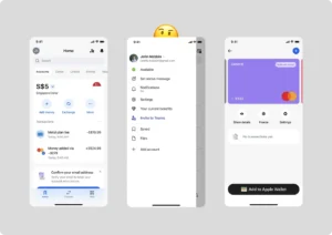
Prior to variables in Figma, the Headspace design system was not only incredibly manual to create, but also prone to misinterpretation, unintentional editing, and time-consuming fixes.
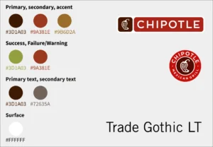
This case study examines the app’s clean visual identity, great presentation of its menu items, and well-designed functionalities that echo the brand’s value of “real ingredients, real purpose, and real flavour”.

Five-second testing is a popular method of usability research used in the industry. It is a quick and effective way to test concepts of visual designs, yet in essence, its core belief boils down to virtually a superstition.
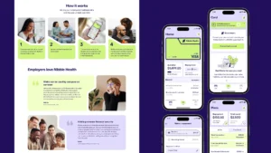
The major challenge set for our team for Nibble Health was to create the design system that translates the brand’s messages: employees should feel protected and encouraged to actually use the healthcare benefits that their companies provide.

Your human-generated guide to boosting your UX team’s ability to build trustworthy and ethical AI-powered experiences.


