
15 Must-Have Chrome Extensions for Product Designers
15 of our favorite Chrome extensions — from color pickers to accessibility checkers — that will boost the efficiency of your design process.

15 of our favorite Chrome extensions — from color pickers to accessibility checkers — that will boost the efficiency of your design process.

Whilst the dream for most designers is to start a new project from scratch and have all of the creative licence and control that comes with that, this unfortunately isn’t always the case. Putting aside those fun projects that you may do when starting out (anyone else guilty of designing multiple travel and adventure apps just for fun?), a large proportion of projects will be some form of a redesign…

Now let’s have a look at physical buttons in product (or industrial) design and what’s happened to those in recent years. If you are strictly a UI/UX designer in the context of design for screens, you should still read this article. In my view, the importance of the experiences of the physical world should not be underestimated when designing for screens. We use the same brain to make sense of…
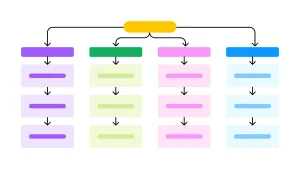
10-step guide on how to design information architecture

Challenges I faced in Design Systems with Cross-Functional Teams

This article describes the impact of disabled buttons on the overall user experience (UX). What are the usability issues related to disabled buttons UX and how can we avoid them?
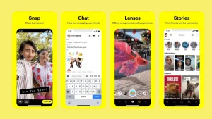
Join us as we delve into the enigmatic world of Snapchat, peeling back the layers of its UI to uncover the secrets that have captivated an entire generation. From its intuitive navigation to its addictive features, we’ll examine how Snapchat has mastered the art of user experience, setting new standards for interaction design in the digital age.

This article is for aspiring designers who are still creating a strong introduction to their UX or UI portfolio. You may be struggling with how to summarize who you are and what your skills are on your resume, LinkedIn profile, personal portfolio website or even your social media page.

Taking screenshots and building the flow from beginning to end provides you with a solid foundation to do your analysis.

In this article, I’ll explain the importance of crafting color-accessible Web sites and explore some practical tips on designing Web sites that are friendly to individuals who have some form of color-deficient vision.


