Design stories

Design Dilemma: Balancing Aesthetics and Functionality

Ideally, aesthetics and functionality would merge seamlessly in digital design, but that isn’t always the case. Here, we discuss when to prioritize one or the other for the optimal user experience.

Key takeaways from Airbnb’s winter redesign

When Airbnb announces something new, it’s the result of months of hard work, thinking, and testing.

The Monotype 2024 Type Trends Report Has Dropped!

For typography aficionados everywhere, there are a few banner days throughout the year to look forward to annually. The release of the Monotype Type Trends Report is one such highlight when the experts over at the heralded font foundry unveil the key trends in the typography space they forecast for the upcoming year. And guess what? Today’s the day for 2024!

‘Scientific American’

Redesign of the oldest continuously published magazine in the US, with a focus on a scientific research and ideas.

Monotype partners with Sharp Type to add 27 font families to library

Boutique digital type foundry at the vanguard of contemporary typeface culture and design finalises asset sale today.  

The era of spatial typography is here

The Apple Vision Pro opens up a whole new dimension for type design.

Exploring the Depth of Design: Principles Driving Innovative Products

These principles shape not just the visual appeal but also the functionality, accessibility, and emotional impact of a product. As we explore the design philosophies of tech giants like Google, Apple, Airbnb, Facebook, and Medium, we begin by understanding the range and nature of good design principles.

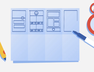
Wireframe Examples

Wireframe-Examples offers an extensive collection of perfectly structured, high-level wireframes to inspire and expedite your next project, ensuring you never waste time coming up with component arrangements again.

Rebrand for LGBTQIA+ helpline Switchboard hinges on the humble speech mark

After 50 years in operation, Switchboard introduces a warmer logo which better speaks to its openness as a listening service.After 50 years in operation, Switchboard introduces a warmer logo which better speaks to its openness as a listening service.  

Thomas Steeles unearths the origins of the world’s most hated font, Comic Sans

An extract from the designer’s recent publication Comic Sans, Is it Really That Bad? delves into the history of the contentious font, uncovering the story of its creation and early uses.  

1 2 61 62 63 64 65 193 194

Submit an article

You can submit new articles related to web design / development, UX, apps and graphic design. No homepage submissions, no spammy affiliate links will be accepted.
Title
URL

Thank you!

Thanks for submitting your story. We will review it and approve it if relevant.