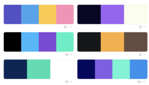
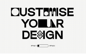
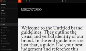
Design stories

The story of the Coca-Cola logo

The Coca-Cola logo is iconic for being universally recognisable. But the brand’s ubiquitous script hasn’t always looked the same.

Visual Trends for 2023

Here is our inspirational guide for 2023 visual trends featuring photography, vectors, mockups, color palettes, and much more.

Collective #752

A truly well designed web experience that will surprise you with buttery smooth effects and stunning details. No doubt, our pick this week.

Apple’s ’10 Year Award’ is one of its most beautiful (and rare) products

A video has emerged detailing an aluminium statuette that Apple gifts employees when they reach 10 years of service. And while the internals aren’t much to write home about (there’s no M2 chip in this thing), it’s as beautifully designed as any Apple product.

Candy Pastels: A Soft and Soothing Graphic Trend

Softer colors, soothing palettes, and a lighter vibe are what the candy pastels design trend is all about. More projects are using this color scheme to create a subtle and softer feel for projects, a distinct shift from many of the bold, bright colors that have been popular for the last few years.

UX/ UI tips: A guide to UX typography

Wikipedia describes Typography as ‘the art and technique of arranging type to make written language legible, readable and appealing when displayed’.

Types of people you work with as a product designer

Design is incredibly visual, so everyone has an opinion!

An insight into redesigning the Midland Appliance logotype

As an experienced design agency, Full Punch understands the importance of creating a logo that not only looks great but also effectively communicates the essence of the brand. In this case, they were tasked with creating a cursive-style typography that would give Midland Appliance a more refined and sophisticated look.

Designing your own AR filter for TikTok*

Augmented reality (AR) filters have taken the world by storm. They allow users to add unique and interactive elements to their social media reels. TikTok is no exception to this trend.

Microsoft’s unused Windows XP logos are pretty wild

The designs, shared by creative director Casey Potter(opens in new tab), came about because “Microsoft wanted an outside perspective for the design of its next-generation operating system, Windows XP.”

1 2 164 165 166 167 168 201 202

Submit an article

You can submit new articles related to web design / development, UX, apps and graphic design. No homepage submissions, no spammy affiliate links will be accepted.
Title
URL

Thank you!

Thanks for submitting your story. We will review it and approve it if relevant.