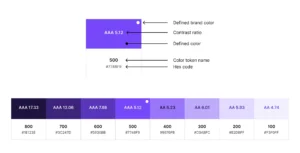
Let’s give Google a break, its latest logo redesign really isn’t that bad
It’s this insistence on using the Google brand colours for everything that has been most criticised in previous Google logo designs.
A stunning web experience filled with vibrant colors, captivating shapes, and uniquely designed layouts. The KOKI-KIKO team has crafted a visually striking website that incorporates seamless animations, perfectly complementing the overall aesthetic.
At Google I/O (their yearly developer conference) they introduced an advance A.I. model along with a set of cool tools and creative software. These A.I. models go by the name of PaLM and Gemini, which sound both cute and futuristic at the same time.
What is psychological safety, and why do your designers need it? Digital designer Alejandro Velasco explains how to create a workplace environment that increases creativity, productivity, and talent retention.
There are hundreds of new tools for designers and developers released each month. We sift through them all to bring you the best.
You might not know it, but the retired German Formula One racing driver Michael Schumacher has a logo. And that logo is revving up some quite intense design debate.
With a gaming interface as its core concept, Sophie Studio’s website design showcases its values, purpose, and expertise in a fun and engaging way.
Pepsi’s recent logo change was celebrated as a return to normalcy. But are there drawbacks to playing it safe with branding?
Thirty-nine typefaces from The Font Bureau, including David Berlow classics Belizio, and Bureau-Grot, join the Monotype Library
“It should be clear and concise, with a kind of beauty and precision which flow not from the quill, but from the compass and ruling pen.”