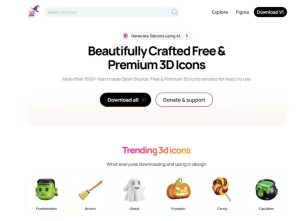
25 Best Free 3D Icons and Illustration Packs for UI Design 2025
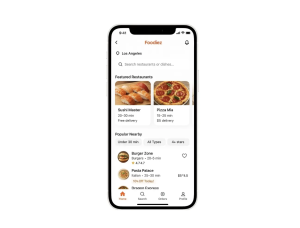
I remember the first time I used a 3D icon pack on a client project. It was a fintech dashboard redesign for a 99designs client, and I was struggling to stand out from 20+ competing designs. Flat icons were everywhere. Then I discovered 3dicons.co, dropped a handful of minimal 3D icons into the interface, and suddenly the design felt alive—modern, tactile, and genuinely different.

.png)