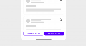
Where to put the primary button?
Where do you place the primary button in a button group? left? right? When does it go fluid? When does it stack on top? There is no right or wrong answer to this. It is more about making a call and sticking to it. Having worked in multiple large-scale design systems, this is my take.

