
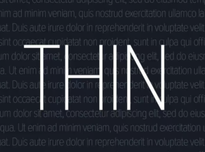
Thin Fonts Are a Usability Nightmare
Thin fonts are like that trendy minimalist couch that looks amazing in photos but is absolutely terrible to sit on. Designers have obsessed over them for years, treating them as a symbol of elegance, sophistication, and high-end branding. But let’s be real: thin fonts are a usability and accessibility disaster.
