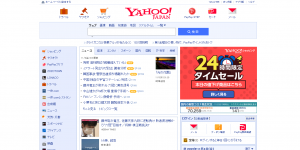
The peculiar case of japanese web design
While the nation is known abroad for minimalist lifestyles, their websites are oddly maximalist. The pages feature a variety of bright colours (breaking the 3 colour design principle), small images, and a lot of text. Just see for yourself with these screenshots taken in November 2022.

